
Just off Regent Street, where the heaving bodies and flickers of colour that illuminate the shop windows and populate the pavements collide, is the Bartha Contemporary Gallery. The current exhibition, Economy of Attention by Mike Meiré is a symphony of heightened dynamics and geometric minimalism produced through a variety of painted assemblages and sculptures. A native German, Meiré is perhaps best known as the creator of the critically acclaimed magazines Eins and Econy, praised for their ultra-modern aesthetics. His work focuses on, as he describes it “life’s evolutionary processes” which he has divided in to three distinct phases: Birth, Biography and Death. The work aesthetically tackles an intriguing and subtle but very concentrated juxtaposition between Meiré’s own highly refined artistic process and the utilization of mundane everyday materials.
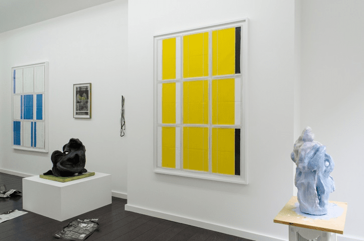
Formed in a long “L” shape, the gallery itself is something of a work of art. The main corridor of the gallery in which the work is situated is very claustrophobic. The walls are overbearing and pristinely white which reflects the fluorescent lights intensely in the space manufacturing a surreal, clinically sterile atmosphere. This makes the work feel somewhat grotesque and alien – almost as if it were a new discovery within a petri dish now on display for all to stare bewilderingly at. This perplexing way in which the work is fascinatingly controlled and mutated by the surrounding environment distorts any humane interaction with the most of the work. A perfect place of residence for the subject matter of Meiré – as his abstract creations seem to take on alienated existence despite being on display. Perhaps this a metaphor for the way in which cultures are becoming so inextricably linked and invasive with one another, but as it does, individuals within it are becoming more and more isolated from one another.
The majority of the body of works on display are assemblages using painted textures neatly segregated in to rectangular and square forms. The creases and imperfections that scar the surface are contradicted by the immaculate use of space and framing in which they sit. The work projects a simplicity and innocence inaugural of a second life. The materials, once discarded soon to be forgotten, have been re-incarnated and evolve in to works of art – a new life. Propaganda (2012) is a spitting example of this birth of new life. One of the bigger compositions, it dominates west wall, its yellow abstract segments raining down ambiguity. Divided neatly in to three horizontal plains and subsequently again divided in to three more vertical plains making nine areas. These are further dissected by markings and paint in to different sizes. The first column is yellow with a thick white border going down either side. This secretes the yellow sections away from the others like a protective barrier. The surface of the yellow is ruffled and tarnished by only subtly. This cannot help but draw parallels to the start of life, where a new born is protected by the mother. The middle section is defined by a thin white line cutting through the yellow segments at the sides and marks scarring the affecting the surface are more apparent when given greater inspection. Could it be that the segments being broken in to different sizes is representational of time periods within a life? Or, perhaps this is a visual allegory referencing an offspring becoming more independent in forging their own way within life. The far right column shows the most radical of changes. It is the only column that is abruptly cut off by black which appears to encroach at the top and bottom of this section. The existential ambiguity of this is simply colossal. Therefore, what could this mean? Questions begin to race around one’s mind leading the viewer in to a morbid sense of curiosity that seems to be almost a taboo subject. The fact that the black sections so aggressively cut through the yellow without warning, could be perceived as an early demise for the continuation of the colour. When made socially applicable it does appear to conjure up a strong resemblance to death. Could it be though, that this is more of a narrative or visual fable? The rows may be representational of three individuals two of whom die leaving the middle one alive but so stricken and afflicted by these deaths that his or her life has become this white emptiness devoid of the colour of life.
The possibilities of interpretation and understanding are endless when viewing this and the other works, allowing them to pull the viewer to and fro in their mind when trying to figure out what it is that a particular work means and says to them. The paintings become so captivating that they can verge on obsessional – a fantastic quality to be able to produce. In turn this means that the economy of one’s attention, how far and much time the viewer is willing to put in, is the catalyst for how deeply this exhibition will, and it will, entrench its visual ambiguity in to the mind.
Mike Meiré: Economy of Attention, 6th July until 18th August, Bartha Contemporary, 25 Margaret Street, London, W1W 8RX. www.barthacontemporary.com
Credit:
Courtesy & Copyright Bartha Contemporary Ltd. London
Text: William Davie

