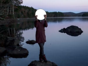
Colour-blocking has been a huge source of inspiration for artists and designers since the early 20th century, pairing complementary shades and producing strong visual contrasts. Bold palettes can be found everywhere, and they continue to influence culture at large, from Mondrian’s rectangles and Warhol’s silkscreens to Pantone’s colours of the year charts. Kate Theo (b. 1979) is a graphic designer based in Puglia, Italy, whose images are defined by block backgrounds, each frame created around the ethos of “essentials and simplicity.” The characters are placed in surreal worlds, subject to their own laws of gravity. Whilst concentric circles hover like ellipses, butterfly cages, golden frames and curtains shroud figures from our view. In each vignette, the backgrounds draw the eye as they consume and juxtapose against their characters. Theo reflects upon the role that colour plays, both internally and externally, as it is embedded in visual culture.
Image Credits: Kate Theo, Untitled. (2021) Courtesy of the artist.


