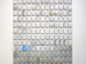
The point was made fairly clearly that absurdities and banalities from the mundane were given centre stage in the artwork of David Shrigley at the preview night. When he addressed the assembled audience of devotees and art students at Bradford 1 Gallery, it proved that such phenomena, when elevated in this way, are recorded with an imperfect, naïve sort of economy. This intended imperfection and naivety of style is achieved with the use of heavy outlines and deliberately crude execution in his drawings. The way in which he explained his methods was deadpan and illustrated with the use of a slideshow highlighting humorous situations in which he had found himself in his own life. In delivering this information to the audience in this oblique yet slightly blunt way he added a personal touch to, and compounded, the unique angle from which the everyday is observed, as imparted by the work. Most of the work currently exhibited at Bradford 1 Gallery is drawn in pen. However, there are a healthy number of colour monoprints also on display.
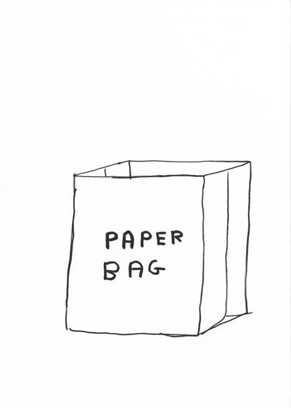
One of those humorous situations in which Shrigley found himself occurred during a holiday in France when he stayed in a Gites. It would seem that the owner of the house was a prolific labeller (perhaps neurotic) of the mundane. Illustrated with the use of many, many photographs (the repetition and multiplicity of slides was humorous in itself), Shrigley showed how almost everything in the house had been labelled, sometimes with house rules stated in respect of the use of objects. In doing so, he acted as a prism through which we could observe the world from his perspective. An example can be found within the exhibition that inspires the humour that arises when something is labelled, pointlessly at first glance, and captures the absurdity of the label and the banality of the object in his imperfect, economic style. This was a crude pencil drawing of a paper bag, labelled simply “paper bag”. The same calmly humorous angle on the world can be found in a drawing of a bare-chested man in profile holding a spear. He is exaggeratedly barrel-chested, but his arms are extremely thin. He also has a frivolous moustache. The simplicity and economy of style compounds the absurdity of the form. Guffaws ensued; as, indeed, they did when viewing a crude drawing of a piece of wood: banal for the sense that it is fashioned, apparently, for some redundant use; absurd for the sense that it is now redundant. When captured with comic economy of presentation, coupled with the caption “Thing made of wood” the tranquil acceptance of both the multiplicity of possible connotations, and the fact that it is just a piece of wood, results in laughter.
Somewhat darkly humorous was the drawing of penguin with an arrow lodged in its chest, blood dripping from the wound. Here the humour seems to arise from the juxtaposition of two contrasting senses; on the one hand the crude drawing of the penguin is cute, on the other it has been injured, perhaps fatally, with the use of the man-made arrow. The simplicity of style compounds the sense of cuteness, heightening the feeling that this is a dark piece. This ironic sense of humour in general, arising from the visual juxtaposition of two contrasting senses, was indicated as an important one to Shrigley in his talk. He showed a slide of a postcard that he had found, the picture and the text of the message displayed side by side. The picture was one of those British-holiday-resort, “Carry-On”-type, saucy humoured cartoons involving naked women and men with hidden erections. The text was written in that shortened, space-conserving, postcard English, and merely described the weather quite formally. When the contrast was intimated by Shrigley, the humour was obvious. Another drawing depicted five vessels, presumably for holding liquid, falling towards the floor. Each vessel had two handles and a crude face drawn on the main body. The handles therefore seemed to be ears. The caption read “We are pottery falling to the floor”. A serious philosophical metaphor is made hilarious because of the contrast of this very seriousness coupled with the imperfection of the execution of these ridiculous head-pots. There are plenty of these drawings on display at Bradford 1 Gallery.
Shrigley’s untitled monoprints are boldly colourful. The innocence of the bold colouring seems to be at odds with subject matter of the prints, despite the fact that the subject matter has its own ambiguity. This is primarily detectable because it is not at all clear what is being depicted, although the images do possess resemblance to mundane things. The execution is deceptively crude to invoke suspicion that there is something dark at play. Of course, this suspicion undermines the sense of innocence brought by the bold use of colour and a sense of unease can be felt. These monoprints do not seem to intend to produce humour, as the drawings do. However, they do have in common with the drawings the employment of unified juxtapositions of contrasting senses. One thing that seems to pervade all the work is that of the innocence of the imperfect, the economic crude style and those elements requiring greater experience to be appreciated. Such “greater experience” allows for the appreciation of the, often humorous, multiplicity of connotations that can be felt.
David Shrigley, until 19 January, Bradford 1 Gallery, Centenary Square, Bradford, BD1 1SD
Daniel Potts
Credits
1. Untitled (2007) copyright David Shrigley.
2. Untitled (2007) copyright David Shrigley.