
There are two ways a viewer can approach a piece of art: they can either see it just as it is – with no preconceived notions – or they can take into account the history of the artist and the period in which it was produced. An unprejudiced view of art is easy to adopt with artists like Richard Diebenkorn (1922-1993), who favours such an approach because it seems to have been his very own, unworried about being in line with the fashions of his time. His retrospective exhibition at London’s Royal Academy of Arts spans his entire career without exhausting the visitor. Its three rooms are dedicated to each one of the great periods of his oeuvre, with enough works (nor too many nor too little) to arrive at a good understanding of it.
At the beginning of his career, Diebenkorn was heavily influenced by Abstract Expressionism. The first paintings and drawings one sees at the Royal Academy were made in the early 1950s and in them it is easy to distinguish the colour of Willem de Kooning, the vaguely organic forms of Arshile Gorky and the black gestures of Franz Kline. Though he resembles them, his works are no caricatures; they are the product of an artist who has absorbed the lessons of the New York school and made them part of his own sensitivity, adapting them to the tones of the landscape of Albuquerque, where he lived in the early 1950s. Pink tones, for example, are calm counterparts to the expressive brushstrokes and lend some of his paintings a certain sensuality. Diebenkorn would become an abstract expressionist in his own right, but then he chose to move away from his style and embrace figuration. With this shift, which would last a decade, the artist defied the dogma imposed by some priestly critics who had announced and celebrated the death of figuration. He was also suspicious of the idea that a wholly American art could be built from scratch, completely ignorant of European influence.
Conscious of the fact that nobody chooses their influences, Diebenkorn did not only not hide his, but was keen to show them off. It was during his figurative decade that they more visibly emerged. The first on his list was Henri Matisse, as the critics and the artist himself stated. The catalogue to the current exhibition perfectly illustrates their shared approaches to composition, especially in interior scenes, almost always with open windows. Already in his late abstract work of the 1950s he had begun to introduce a certain structure in his works, lines that defined spaces between arbitrary areas of colour. It might have been this search for structure that lead him to figuration. Be it landscape or interiors, his figurative paintings are rigorously constructed, drawing inspiration not only from Matisse but from Piet Mondrian, whom he also admired. But in these works colour is just as important as form. The bright light of California created the same sharp contrasts of light and shade as in the southern atmospheres of Matisse and Pierre Bonnard, with whom Diebenkorn shared not only an aesthetic but also an intellectual credo, as is evident in a few small still lifes which are as emotionally-charged as portraits.
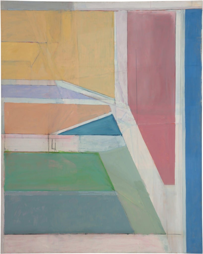
If Diebenkorn obtained a high reputation as an abstract expressionist and later as an exceptional figurative painter, he was still capable of a new move to abstraction which would place him as one of the most important artists of the second half of the 20th century. From 1967, he began a series of monumental paintings which he titled Ocean Park, which was the name of the area of Santa Monica where he had begun to live. In the series he was able to condense the colour of Matisse and the structure of Mondrian. The first paintings in the series seem a little too rigid, more like experiments than wholly satisfactory works. It was from the mid-1970s onwards when Diebenkorn began to dominate his new language, maintaining clearly-visible structure without compromising colour: the brightness of Matisse controlled; the rigour of Mondrian without authoritarianism. The colours are light and transpire the white of the canvas. The fine lines of charcoal define forms which are sometimes unfinished, covered at intervals by coloured stains. Because he didn’t resort to entirely rigid forms nor opaque colours, in each of these so apparently well-structured paintings there seems to lie a “riotous calm,” as Sarah C. Bancroft puts it in the catalogue.
Diebenkorn is the perfect incarnation of well-understood artistic influence, which is the opposite of imitation. Influence is born with time, from the deep knowledge of the work of the artists one admires. He seemed to understand this very well, and that is why his shifts in style are perfectly coherent, the result of permanent investigation. It didn’t seem to interest him very much if his changes in style were what the critics were expecting. Even his risky move to figuration in the mid-1950s probably did not aim to irritate anyone. The panoramic view we get of his work at the Royal Academy proves that the artistic evolution of Diebenkorn were not acts of bravery but of honesty.
Richard Diebenkorn, until 7 June, Royal Academy of Arts, Burlington House, London.
Rubén Cervantes Garrido
Credits
1. Richard Diebenkorn,Ocean Park #27, 1970. Oil on canvas. 254 x 203.2 cm. Brooklyn Museum. Gift of The Roebling Society and Mr. and Mrs. Charles H. Blatt and Mr. and Mrs. William K. Jacobs, Jr., 72.4. © 2014 The Richard Diebenkorn Foundation.


