Printin’, tucked next to Diego Rivera’s solo exhibition, runs in conjunction with the larger print survey Print/Out currently showing at MoMA, New York. Print/Out is the third large scale exhibition organised by MoMA’s Department of Prints and Illustrated Books since 1980. It is unclear as to whether these two earlier iterations had accompanying exhibitions but, in this case, the smaller show is by far the more interesting.
Co-curated by Ellen Gallagher and Sarah Suzuki, from MoMA’s Print Department, Printin’ includes work from over 50 artists with Gallagher’s print portfolio DeLuxe (2005) taking centre-stage. Consisting of 60 prints of collaged hair and beauty product advertisements taken from African-American magazines such as Ebony or Sepia, these prints are laid out in framed grid formation. A sheet of girls heads are obliterated by Kraft cheese slice haircuts, black and white eyes peering out or whited out like zombie’s. The variety and complexity of collage techniques and materials allows for multiple readings but hair and its political conatations is the works primary focus. The true introduction to Printin’ is, however, the opening 16mm works from Len Lye; Particles in Space (1966) and Free Radicals (1958). Made by scratching marks with various implements such as dental tools directly onto film, they jump and dance with soundtracks of tribal drumming and singing combined with sounds from Lye’s own kinetic sculptures. White letters sometimes appear, jagged and spinning, chalk written by a poltergeist on a school blackboard. These films provide the context for thinking about the possibilities and limitations of print. You come back to Lye’s films as you look, later, at Mariana Castillo Deball’s white folded paper lines in Initiations (2009) or in the scratchy surface’s of Rauschenberg ‘s studies.
Ideas of soundtrack, music, language and spoken word emerge repeatedly. On Loan from SFMOMA is Martha Rosler’s The Bowery in Two Inadequate Descriptive Systems (1974-5). A photograph text grid of forty five gelatin silver prints, the work shows images from infamous and now partially gentrified drunk hangout and flop house destination The Bowery in the lower east-side of Manhattan. The images depict remnants of alcoholism, empty beer bottles, piles of whisky or gin bottles and each are accompanied by descriptive words for drunks and drinking, ‘Loopy, Groggy, boiled, potted, fried to the hat’. A critique of the sentimentalisation of documentary photography, the words also become a form of concrete poetry. This is seen again in Louise Bourgeois’ print, No (3) (1973) with its cut-out ransom-style letters ambiguously repeating the word “NO”. It is an incoherent ramble, a protest or a 2 Unlimited pop song lyric. It could even be that by saying “no” so many times, the voice emanating from the print, is trying desperately to say “yes”.
Elsewhere, Claes Oldenburg’s lithograph Alphabet in the form of a Good Humor Bar (1971) is an edible, visceral representation of language. The “good humor bar”, an ice-cream bar with cake coating, is built up of pink balloony letters that look like innards. The letters coughed up from a raw pink throat, choking on strawberry shortcake.
The dates and artists hop from decade to decade, from medium to medium, yet Printin’ avoids feeling disjointed or ill-considered. At the centre of the exhibition, works are grouped in small thematic sections. In one particular arrangement around travel or landscape, a graphic style lithograph by Pudlo Pudlat, The Settlement from a Distance (1982) hangs next to a George Herriman’s Krazy Kat print from 1925, Edgar Cleyne’s photograph’s Crater (2011) and Garden (2011) and the sublime Vija Celmin’s Ocean Surface Woodcut (1992).
The last gallery is by far the one that holds the most treasure. David Hammon’s work Untitled (Kool Aid), 2003, is covered by a white raw-silk veil and can be viewed by appointment only. I, like most others in the room tried to get a glimpse of the hidden image underneath, made with the sugar powder concoction. I failed to see a thing, but the fascination lies in the mystery, evoking Kool-Aids psychedelic decadence; Pink Swimmingo, Purplesaurus Rex, Swirlin’ Strawberry-Starfruit and Oh Yeah! Orange Pineapple.
Hanging opposite Hammon’s work is Stanley Brouwen’s Steps of Pedestrians on Paper (1960). I know little about Brouwen’s work but reading Print Department intern Lotte Johnson’s blog informs me that Brouwen is an artist of particular interest to Hammon’s and one who refuses the norms of museum and gallery display. He refuses to let his work be reproduced in catalogues of have any gallery label information, such as the artists nationality and birth-date for example, printed alongside his work.
Several of the works, in this final section, are paired up, juxtapositions of old and new printing methods. Sylvie Fleury’s Cuddly Painting (Delph), a fuzzy fur canvas printed Delftware blue and white with images of polar bears, deers and wolves, is arranged with an Inuit print from the community of Cape Dorset on Bufflin Island. This was the at the centre of contemporary Inuit art in the 1950’s, one popular method of printing production being to appliqué animal skins.
In another case, a scratchy Jean Dubuffet is paired with an aluminium enamel silver sprayed square of cardboard leaning against the wall from Cady Noland,(Not Yet Titled) from 1996. Originally produced as multiple for Parkett no. 46, the cardboard has holes punched into it of different sizes, some pushed through, some just left. Bashed up and textured like a cartoon car bonnet or John Chamberlain sculpture. The wrinkles of the painted cardboard mirror the marks of Dubuffet.
Finally, a mesmerising work, from botanical illustrator and printer Alois Auer brings together photography, complex printing technique, historical document and extreme beauty. Auer was an important figure in the development and popularisation of the process of nature printing (Naturelbstdruck) in the 1850s. Two examples are on display at MoMA, a bat and snake that have been “rolled or pressed between two plates, on lead, one steel…the soft lead took the specimens exact impression and then the plate was inked and printed”.
The bat is the sadder and more poetic of the specimens, looking like a broken umbrella falling through the sky. Despite being an impression and not actual skin and bone, the image has such detail, reality and dynamic energy. All it would take perhaps is a direct crackling lightning strike from Len Lye’s film to make it come back to life, un-stick itself from the pages and fly out into the New York night.
Printin’, 15-02-2012 until 14-05-2012, MoMA, 11 West 53 Street, New York, NY 10019. www.moma.org
Credit:
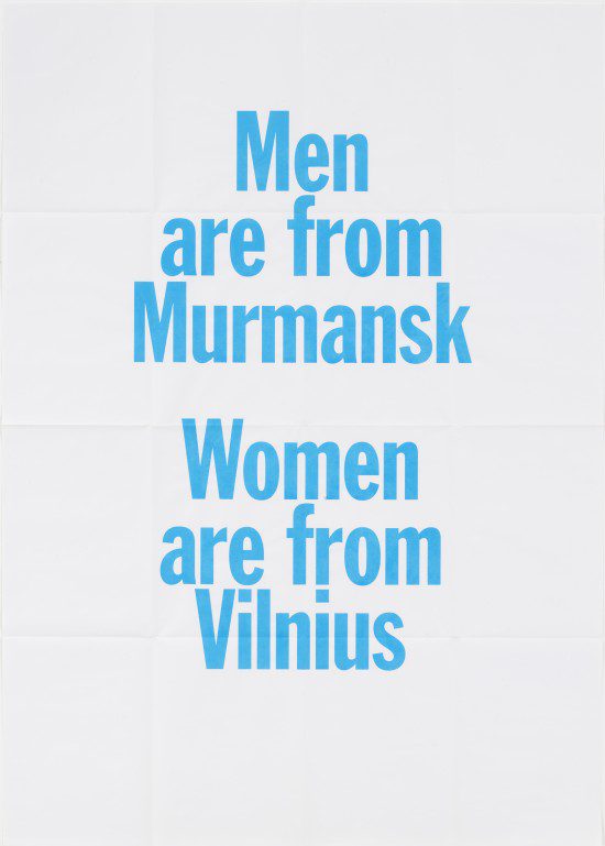
Slavs and Tatars (artists’ group, established 2005)
Nations (2007)
© 2012 Slavs and Tatars
Text: Sacha Waldron